
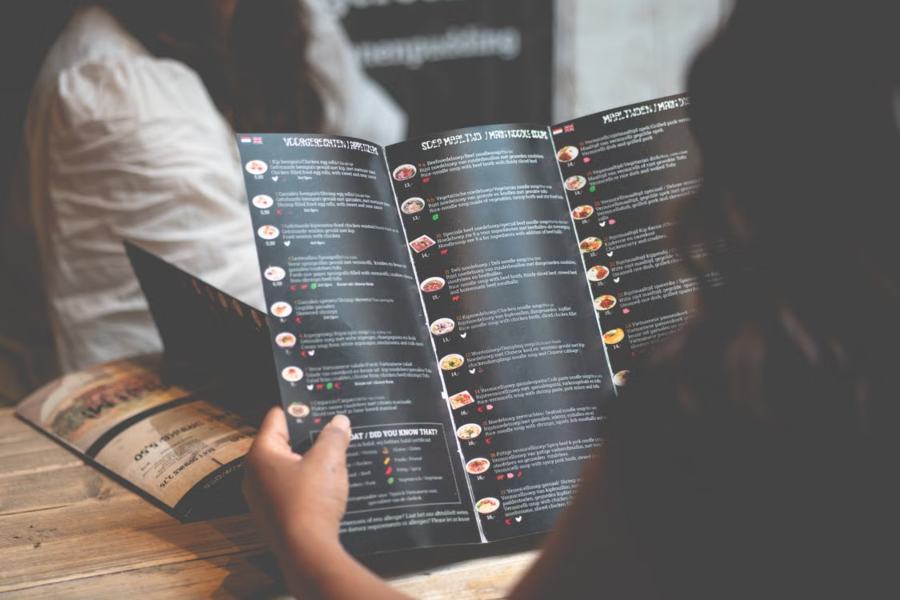
Menu engineering gets all the attention — item placement, decoy pricing, removing currency signs. But before a guest reads a single word, they’ve already formed a price expectation and a quality judgment from something more primal: what the menu is. The physical object shapes the order more than most operators realize.
The First Judgment Is Haptic
The menu is usually the first object a restaurant hands its guest, and decades of consumer research point the same direction: weight and texture transfer to perceived value. Heavier objects are judged more important and more expensive; textured, natural materials are judged more authentic. Hand a guest a curling laminated sheet and their brain quietly benchmarks the kitchen accordingly. Hand them a substantial menu in a wooden or leather cover and the same $28 entrée reads as fair — even generous.
This isn’t decoration; it’s pricing infrastructure. The menu’s material sets the reference frame within which every number on it is evaluated.
What the Cover Does to the Numbers Inside
Consider what actually happens in the first fifteen seconds: the guest receives the menu, feels it, opens it, and scans. Experiments in menu design have repeatedly shown willingness to pay shifts with presentation quality — same dishes, same prices, different perceived value. Operators who upgrade menu presentation typically report three effects:
- Higher acceptance of premium items. The $38 dish stops looking like an outlier when the object presenting it agrees with the price.
- Longer engagement. Guests browse well-made menus longer, encountering more of the menu — including the high-margin items you placed carefully.
- Fewer “menu shock” moments. Price resistance drops when material quality and pricing tell the same story.
Matching Cover to Concept
The right cover isn’t the most expensive one — it’s the one that agrees with your positioning:
- Fine dining: rigid covers in wood or leather, understated engraving, interchangeable inner sheets for daily menus.
- Contemporary casual: natural wood covers with visible grain — premium but warm, and they photograph beautifully on the table.
- Bistro/café: clipboard-style wooden boards or slim covers; casual but deliberate.
- Bars: compact, durable covers that survive spills and candlelight — dark stains hide wear elegantly.
The unifying rule: guests should feel your price point in their hands before they read it. If you charge premium prices with disposable-feeling menus, the mismatch taxes every order; if your menus feel better than your prices, you’ve built margin headroom you can use.
Practical Specs That Matter
When ordering, four details separate menus that last from menus that embarrass:
- Changeable inserts. Menus change; covers shouldn’t. Screw-post, clip, or band systems let you reprint paper, not hardware.
- Engraved (not printed) branding. Engraving survives thousands of sanitizer wipes; printed logos fade in months.
- Sealed, food-safe finishes. Ask specifically about commercial sanitizer resistance.
- Size discipline. Oversized menus fight small tables — measure your two-top before choosing a format.
Made-to-order suppliers cover the full spectrum now; workshops offering custom menu covers engrave logos and match stains to your interior from single-piece minimums, which puts coherent presentation within reach of independents, not just groups with procurement teams.
The Handoff Ritual
The object matters; so does the two seconds of theater around it. Menus presented open, or handed rather than dropped, receive more attention — and attention is the whole game, since guests decide most of their order in under two minutes. Train the sequence: menus arrive with the greeting, handed to each guest (not stacked mid-table), specials named while hands are still on covers. Rooms that treat the menu handoff as a service moment consistently see guests engage longer with exactly the pages operators want read.
The digital parallel deserves a sentence: QR menus skip the haptic channel entirely — no weight, no texture, no value transfer. That’s an argument for hybrid service, not against QR. Let the physical menu carry the brand impression at seating, and let the code handle reorders and payment, where speed beats ceremony.
The Cheapest A/B Test in Hospitality
Skeptical? Run the test: order quality covers for half your tables for one month. Track average check, dessert attachment, and any review mentions between sections. The hardware pays for itself quickly when a two-dollar-per-cover object nudges a fifty-dollar average check up by even a few percent — and unlike most revenue experiments, this one leaves your kitchen, staffing, and prices completely untouched.
The menu is the only marketing document with a 100% read rate among paying customers. It deserves a better vehicle than laminate.